Sunday, October 27, 2013

Fading Differences

Not long ago I created a piece of land art that copes with the topic ofthe different ethnic grounds of people in most cities.

When challenged to create a photo manipulation concerning both, globalization and language games, I remembered my former creation. It was not at all about photography, but naturally I took photos to document the installation.

Apart from the topic of different people, the little squares reminded me on pieces of the scrabble game.

I presume scrabble is more a game of western industrial countries, but they may exist for other languages, that use a different character set, like keyboards do.

I have chosen the English language and its characters to symbolize globalization, because almost any citizen of the world knows English and uses it to communicate internationally. Then I looked up what globalization “looks like” in different languages, especially in languages with characters different from those of the English language.

I combined a photo of the land art piece with these characters, where the Non-english characters fade into the surrounding like the colored grounds themselves. I did this for four language. I also created a sphere from the four images, which represents the globe.

I intend to present the images via a viewmaster, where the differences became clearer while circling through the pictures. You will find many viewmasters throughout an imagined the museum with an exhibition on the topic of globalization and language games. any visitor can take the viewmaster to circle through the images.


This post is inspired by an open online art course.


Thursday, September 19, 2013

Design by Programming

Processing is a script language with which it is relatively easy to generate colors, shapes and interactivity.

For a start I created shapes like rectangles, ellipses and triangles to design an abstract landscape. I took a sheet of quad-ruled paper and looked for the coordinates I needed to place the shapes on the screen. The colors I find with the help of a color selector, that is provided by the processing interface.


Now I had all the information I needed to create my first Processing sketch.

Here I imagine a landscape with a planet (moon, sun) and a triangle which moves through the landscape.

Landscape - created shape by shape

The next step in sketching with Processing was to let a shape be drawn by the program within a loop. I also added randomness for the colors and for the coordinates of the shapes.

My intention was to contrast splintering (triangles) with entirety (circles). This can be a symbol for, for example, an immigrant family contrasted to a native family.

Round versus Triangular 1 - randomly generated   Round versus Triangular 2 - randomly generated

Round versus Triangular 3 - randomly generated

  Round versus Triangular 4 - randomly generated


The last step with my first experience with Processing was interactivity and by that generative design.

The interactive part of my script provides the possibility to drag the mouse button over the screen and this way to display thin bars.

The stroke and the fill color of the bar is chosen according to the position on the screen. You also can clear the screen with any key and by that generate a new background color, again depending on the mouse position.

This way you can partly control the process, but because of the complexity of the procedure most people may try to generate a stripe design by "playing around". Look the following examples,

I intended to give the possibility to create playfully ones own space, but you can also use it to design a nice pattern of stripes.

Generatively designed Stripes 5   Generatively designed Stripes 6

Generatively designed Stripes 7

  Generatively designed Stripes 4

and here the genesis of the last example.


Generatively designed Stripes 1   Generatively designed Stripes 2   Generatively designed Stripes 3   Generatively designed Stripes 4

Blogger does not provide the possibility of running Processing within this post, but here is the example I used as a basis for creating my sketch.


This post was inspired by an art online course:

Introduction to Computational Arts   


Wednesday, September 18, 2013

The Discovery

This is about part two of a digital painting. The first part was about finding a painting with atmospheric lighting, switching human heads with animal heads and exploring the colors for my version of the painting.

Rembrand And Me

I got a comment for the first part,
 
Say, do I see a wicked witch on a broom there? Nice challenging project to learn about Gimp!
 
and according to this comment I've made slight changes to my basic idea. A huddled figure in the foreground and a witch instead of a housewife in the background.

Rembrandt&Me Witch Try

Naturally I was interested what Todd may say now:


A new challenge and I loved the idea, anyway! Although I was not particularly sure how serious Todd was. I did not mind.

Rembrandt & Me with leguana and cookies.

I again tweeted to Todd:


This time Todd was a bit unpatient, but I was grateful for his statement, which lead me to realize how different people perceive art. I presume Todd finds peace in more traditional paintings, rather than in one that  turns everything topsy-turvy.

calminchaos
                                                                Todd's "Calm in Chaos"

However, I have to find my way and proceeded after Todd's beautiful imagination, and finally I found a close where I thought it is not necessary to do further changes.


The Discovery

The following is the picture with which  all began:

Christ+in+Emmaus-1024x768-19214


Friday, August 2, 2013

Rembrandt & Me


Confronted with Rembrandt as a master of painting when starting a digital painting assignment, I thought it appropriate to choose a painting by Rembrandt, where he depicts the resurrected Jesus and two people who realize this astonishing and frightening fact.

Christ+in+Emmaus-1024x768-19214
http://www.kunstkopie.de/a/rembrandt/der-auferstandene-christu.html

The assignment was to take a painting with interesting lighting and by using a special painting technique making four color compositions. It was meant to start each of the  four compositions anew, still I decided to make one painting and altered the colors via the color options of my photo editing softsare, which is Gimp.

I am a completely new digital painter and needed many hours to accomplish the color compositions and half of the time I needed to understand how my software can help me with this. This meant to learn shortcuts and using the lasso tool to select a rather exact shape, or using the gradient tool by choosing the direction and color, or navigating through the painting, or ...
I thought this may be enough for my first digital painting and I can always improve in the following assignments.

Rembrandt And Me, 4 Times

As I understood it I have to choose one of the compositions to proceed painting on it, still, I like all four of them. I may decide for the green one to convey the notion the setting appears in the middle of nature. It is still an intuition and I am excited to learn where it will lead me.

I have started the assignment by making some drawings, which was part of it and which you needed as a guidance through your painting. I also had to put a head of a fancy animal onto the bodies of the painting. This way I drew some little lambs to got a feeling how I can put them into the painting. I also drew the feet of little lambs, because I wanted to change the hands of the people into 'hands' of little lambs.

Rembrand And Me Rembrandt
More Little Lambs Little Lambs


If you are interested in Chris Oatley's digital painting course, just click here.

Friday, July 5, 2013

Dream Dig

There once was a time I had time. I thought out what I still can do in this world, like travelling, cooking exotic meals and doing artwork or handicraft. Then I got a job, where I had to communicate about how magnificent people are when they are young or at least male. I tried to oppose but was overwhelmed by the unity of my colleagues. I retreated into a world where not even I was aware anymore of what is important to me.
Now I have lost the mentioned job, et voilĂ , my dreams are back; not just like that, but I have found online possibilities of sharing, where people think differently from the ones around me. Maybe they are just not so aware of my gender or age, because online these details blur. People here are occupied with my artwork and blog posts rather than with thinking about my biological reality.

This process of having lost my dreams for my future and finding them again I have displayed in form of a collection of spices and handicraft materials. These materials symbolize some of the activities I am rather dreaming about than doing them: cooking, travelling, doing things with my hands. Still, I do not give up having time and money for them one day. I also would like to have a piano or jumping from a diving board, but this is more difficult to create a collection from.


A collection of finds.


Finds in little boxes, named.


Spices, feathers, beads symbolising buried and found dreams.


Spices for far away coutries I would like to travel to.


I folded boxes from origami paper. Then I stuck the materials on little cardboard squares, together with a mixture from sand and charcoal . It was exciting and mysterious when I had to use a brush to clean the spices or beads from charcoal dust and sand. I put the so prepared squares into the boxes and used scotch tape to partly close the box to protect the content from being touched. This symbolizes shielding, but also isolation. I stuck the little boxes into a bigger box and gave written descriptions underneath or above, like it is done in a collection of a museum.

For this artwork I was deeply inspired by the videos about Joseph Cornell, Andy Warhol and Mark Dion, which are provided by an online art course.
Joseph Cornell created little worlds, which often appear isolated from the world around, Andy Warhol stored his past in boxes and Mark Dion pretends to be an archaeologist while creating his artwork. This is what I took out of the videos and what influenced my work.

Sunday, June 30, 2013

Colorful Grounds - a Land Art adventure.

In spring when it finally went warmer after a long and cold winter I walked through a park and found this, remains of a little party.

Childrens Pary - Land Art Inspiration 3 Childrens Party - Land Art Inspiration 1

I supposed the dirt was left by kindergarten teachers. I know them caring about nature and asked myself, why they did not take it to a garbage can. Then I thought it looks a kind of nice.

Later, when I reflected about doing an environmental installation I remembered this thoughts and images. Surely the children of the party where various in their ethnic backgrounds and I decided to include this idea in my installation.

Colorful Grounds Land Art


Still, I did not only consider children but people of all ages, when I built colorful squares from clay, put a delicate green wire in it and added origami balloons (or if you like squares) on the top of the wires. I arranged them at one of the green spots in Berlin and took care of doing this in a meadow with high grass and wild flowers. The reason is first that my pieces look very nice here, but also that the colorful clay squares are hardly noticeable, although they add enough to the visual impression.

Floating Origami Balloons.

Hardly noticeable ethnic grounds.

This is meant to be a symbol for people with various ethnic roots and backgrounds, which often is not really clear. This is my perception, although I know there are people who would like all people even more similar. Yet, look for example to the Arabian countries and how people look like there, and then look where people look like in western industrial countries. You always have to admit people with Arabian background here look more like people in the western countries.

Despite all this meaning, I loved waiting for the right weather (it rained all week), going outside early in the morning and watching this little beings floating in the wind. I did a little video to give some impression of this to you.


Now I have the dream of taking this little package with me on a journey through the worlds cities and make similar photos and videos from this.

Land Art Package


For the video I've used two sounds (the autofocus did so much noise in the original sound):

wind chimes:
http://freesound.org/people/CGEffex/sounds/96643/

wind through trees:
http://freesound.org/people/alienistcog/sounds/123911/


This post is inspired by an online art course.

Sunday, June 23, 2013

Butterfly and Shark - a self portrait.

I have already drawn and painted many portraits. My biggest project here was painting 12 characters from the early Harry Potter Films. While I have painted these portraits I realized that the character appears to get hold of me, which was a bit scary. I thought I would never paint a person I know personally in this intense way, nor would I paint me.
Yet, when thinking about doing a collage of a person after a black and white photography I decided to take photographs of myself and to try a self-portrait.


Me posing


 I did not know that this work will be so demanding. I cut out snippets of a black and white newspaper for hours and arranged them after the values of the photograph. Then I realized that, if I will go on like this, the result will be a boring picture, like another photograph, just a bit out of focus. I decided to change the approach and looked for something to give the picture more vitality. I found two images of a butterfly and a shark and added them to the picture.
Then I covered the remaining surface of the paper with strokes of a light blue and a grey marker which improved the collage in a way that I knew it is time to stop working on it.


Butterfly&Shark


Butterfly&Shark - Detail

Apart from the long time I had to work on the collage to make it something interesting, it also was an adventure to look at myself in this intense way. To see how my nose or eyes look like was one thing, but I also got a kind of new relation to myself. It was like being together with a person for a long time without saying anything, but you definitely drew nearer to that person.

This post was inspired by an assignment of an art online course.

Sunday, June 16, 2013

I miss my childhood friends.

Because I have started sharing my work and ideas in the world wide web, I have a lot to do with communicating with people I have never met. This is intriguing to me, still, it is not much about having friends, with whom you can meet and go to the pool or into the theatres or listening to good music or going around with the bike. In fact it is not just that online relations are not available for having this kind of fun together, but it is the same  with my adult friends around,  who are all very busy, including me. In fact I often have more connections to my virtual companions than to close people around me.
By these thoughts and facts I felt inspired to create ten envelopes with names of some childhood friends on their front together with an @. I have no connection any more to these friends, so that you have to take the Internet addresses on the envelopes as invented.


Naturally where are envelopes there must be inserts. I just remembered that I loved playing Memory and painted animals on squared paper, which face each other in pairs. By creating the insert in a naive way I refer to children and their ways of creating and being together, which can be described as uncomplicated and easy and still very sensitive to people who surround them.


However, this is not meant to be just a single creation, but in the sense of artists *, whose mail art I admire, I want to really sent about ten envelopes to people in the web and I intend to ask them to meet a person, who got one of the remaining 9 envelopes. This will be the person with the animal on it, which reflects the animal he or she got. They can meet virtually or at a real place, yet, they should create something together. If they meet they can take a photograph from themselves with the two cards or they can sent the images of the animal to each other and make one of it. They may sent it back to me and I will upload the image to an online photo album which will be public.
With my post to any participant I will sent 4 web addresses and an explanation. The participants have to ask the four other participants if they have the matching card. If having found the right person they have to communicate how to realize the shared creation. I think this as a fun game, like the ones I have played during my childhood and I try to convey this experience to people related just via the Internet.

As fast as there are results I will include a link to them here.

*
Some Mail Art Artists:
Ray Johnson
Eleanor Antin
Ryosuke Cohen

This post is inspired by an online art course I currently attend.


Saturday, June 8, 2013

Word's Paradise

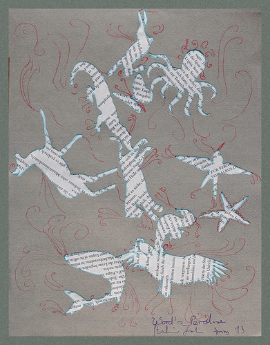
Watching a running lion and antelope in reality immediately leads to the association of the lion hunts and will hurt the antelope. Looking at a picture that depicts both animals running leaves more possibility interpreting to the viewer. The audience may imagine them playing around, just their knowledge about beast of prey and the prey itself may lead them again to a scene where the prey is chased. Two buildings from words  like 'running lion' and 'running antelope' leaves imagination more space. You even could imagine a different, paradise-like world in which both, lion and antelope are playing together. This is what the collage tries to convey.

Word's Paradise

I looked for animal shapes, each from different character: peaceful, wild, treasures ... I used a ballpoint pen of light blue color to draw the contours of the shapes on book pages and I cut them out.
After throwing them on a piece of paper I glued the shapes where they have ended up. In addition  I drew red curly lines to indicate a fantastic world, where delicate feathers and tentacles are part of the animals.
The animal shapes with the words in it are meant to be something between a word and a picture. The way they all have the same appearance except from the shape makes them on the one hand similar on the other hand different. I used chance to arrange them on the background paper. Animal shapes like animal words are meant to be equal and using chance guaranteed that I will not put any animal in a more important position, maybe according to the golden rule. On the collage predators exist side by side to prey like in paradise.
For this artwork I'm mostly inspired by Jean Arp who produced artwork using chance. He also used natural shapes, which but are different from my shapes, because they are more biomorphic like a kidney shape than being shapes of real creatures. I still wanted people to have in mind the category of predator and prey, which we think can live together just in paradise. A kidney shape could not have conveyed this.
I'm also inspired by the arrangement of animals in Rousseau's pictures, which often appears as if any being lives peacefully aside their neighbours. Just your imagination tells you if they do or not. You can continue the story in your own way.

When I cut shapes out of book pages some of the childlike Dada movement  also came into my artwork, while I was remembering that children love drawing on printed pages o cutting them, which is generally forbidden. I allowed me to ignore this value of the adult world, that Dadaists often refused. Still my artwork is not meant to be senseless, which it often was with Dada artists, but for the future I'm intrigued of making artwork which makes not much sense to the adult world, maybe especially to the war part of the adult world where it is not possible to peacefully live together.

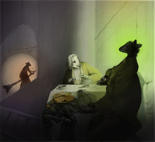
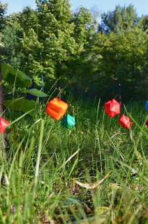
The following shows some detail.


This post is associated with an online art course I currently attend.


Friday, May 31, 2013

Painting on a conveyer belt.

Some time ago I started a painting project, where I see to parallel paint about 30 pictures. The original idea of Georg Kleber even proposes to paint 30 pictures in 3 days. After I've now completed half of it, I dare say I am not the type of painter for this. I feel as if I must work on an assembly line. First I already needed two weeks and after any step I felt confused by not getting all of what I've created, even worse I could not achieve the quality I feel obliged to achieve. In addition I felt like switching channels and looking shortly what is on, restless, never finding any peace by deepen anything in a painting. I also often got sick of the themes (for each step one theme), first they were elephants, then colourful round forms. Now I am sure I will not paint elephants any more and I may turn to rather paint in black and white or with brownish and greyish colors.

Still, I've achieved some beautiful results, and I will go on. The next step may be people drawn with pastels and the last step is to just finish any painting which is still in need of further treatment.

These paintings are finished, but 18 more are yet to complete

Freed Painting IShadow ReflectionYellow BackgroundHeavy BurdenCreviceAngry Balance
Elephant PlanetBack of an Indian ElepahntWhite & Black pluss Blue LinesWindmillSea AnemoneBig Ball
Happy ElephantWheel & RibbonChain Of LightsAsian CalligraphyMysterious Musical Instrument33 Loveley Elephants
Second Treatment

Freed Painting, ein Album auf Flickr

Present state of my Freed Painting Project.
(last state)

Second Treatment